3 Must Have Tools from 10 Artists and Designers
- maddeyfields
- Jan 13, 2021
- 6 min read
As artists, we all have those few materials and tools that we just cannot get enough of. We have those must have items that make up our artistic tool kit. For some, those must have items are digital applications and tools which allow rendering, painting, and designing digitally, while others rely on classic methods and tools such as paint, canvas, and paper.

We asked 10 talented, established and up-and-coming, artists and designers, across a variety of fields, the following question; besides a classic sketchbook, pencil, eraser, and sharpener, what are your THREE must have materials, tools, or digital applications?
Listed alphabetically by last name, here is what they said!
Lance Balderson, Painter
“Top 3 materials:
1) Acrylic paints (Liquitex), because they are water soluble, flexible, dry quickly,
and don’t fade. Additionally, I use Liquitex Gloss Medium and Varnish, which I
dilute with water and mix with my paints, because it gives them a satin finish. If
trying to achieve transparent layers of paint, this medium thins the paint and
helps it adhere better than if thinned with water.
bought pre-stretched canvases for smaller paintings, but prefer to stretch
myself. I do not like working on panels or boards, because I find they warp. A
canvas you can manipulate the corners to make it square or flat.
3) Lighting - Natural light they say is best, but I work all times of day, so setting
the right light is important. I still use incandescent lights, because they provide
a warm light. Everyone who knows me, knows I do not like fluorescent or these
new LED bulbs, because they are too harsh."
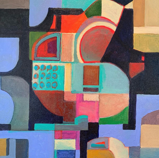
You can check out Lance’s artwork below was well as on his website and instagram.
Website: www.lancebaldersonart.com
Instagram: @lancebaldersonart
Alyssa Barnett, Fashion Student
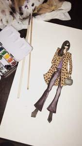
“I would say (my three favorite materials are) a ruler, a rotary cutter, and Daniel Smith water color paints.”
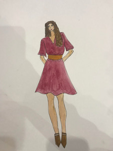
You can check out images of Alyssa’s artwork below.
Alex Bruce, Graphic Designer
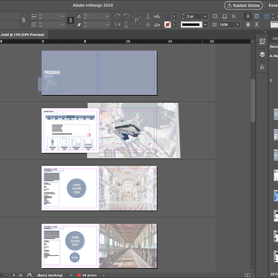
"As a graphic designer, the trio of Adobe’s main design programs (Illustrator, Photoshop, and InDesign) are all pretty vital for what I do (I’m gonna cheat and count these all as one, sincere apologies). I work for a small studio called Headcase Design that primarily works in Publishing doing book design, both covers and interiors. We work most often in InDesign, with Photoshop being a major tool for developing cover artwork, as well as more complex graphics and photo treatments for interiors. Illustrator was the first program I ever learned, and I still use it frequently for early designs and working with typography. I’d say InDesign is the most important for me, but Photoshop is the most fun, and feels the most freeing.
Beyond digital applications, I find scanners to be really useful and fun tools. There’s always limitations imposed by the computer, and using a scanner in different ways can help break those. Bringing in hand-drawn marks and drawings can bring a texture and warmth to work, and help sort of violate the structure of digital stuff. It’s also super handy for bringing in different paper textures and ripped edges that I often need for professional work, stuff that just can’t be faked easily or convincingly.
Lastly, a personal favorite for me outside of design would be embroidery materials. Embroidery is time-intensive and so rewarding because of it. I’ve only done a handful of pieces, mostly as gifts for friends and family, but I find that it’s a great contrast and complement to design. It requires the same sort of skills and sensibilities, but the tangible materials make a huge difference. I love choosing and committing to thread colors, dumping in hours and hours of time before really seeing results. Spending so much time working digitally, it's always so refreshing and meditative to work with my hands again."
You can check out Alex’s artwork below as well as on his website and instagram.
Website: alexbruce.co
Instagram: @alexbrucedesign
Marissa Cutry, Architect and Jewelry Designer
"Must have Materials:
ARCHITECTURE
'OLD SCHOOL'
1 - Trace Paper
2 - Sign Pen
3 - Architectural Scale
ARCHITECTURE 'DIGITAL' 1 - Creative Cloud Suite (Photoshop, Illustrator, InDesign, Lightroom) 2 - Rhinoceros (3D Modeling Software that can export drawings, 3D prints, laser cuts) 3 - Revit (BIM - Building Information Modeling Software for creating construction documents and final drawings)
For the 3 architecture tools I struggled whether to give some old school 'classics' vs. digital tools for architectural education - so I gave both. I use both almost everyday and think they are equally important to being a designer.
CLAY
1 - Pasta Machine (for conditioning and flattening the clay)
2 - Ceramic Tile (a work surface that can go directly into the oven to bake the clay)
3 - Clay Cutters (3D printed forms - made of PLA - that act just like a cookie cutter to get the earring shape I want)."
You can check out Marissa’s artwork and must haves tools below as well as on her architecture and clay jewelry instagrams.
Instagram (Architecture): @lines_by_marissa
Instagram (Clay): @finandgrove
Charlie Dunkel, Illustrator and Painter
“For my favorite materials;
Micron plastic nib pens
Princeton watercolor brushes (Size 0 filbert brush & size 3 round brush)
PH Martin’s concentrated watercolor.”
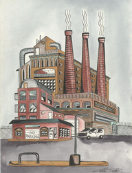
You can check out Charlie’s artwork below as well as on his website and instagram.
Website: www.shopchunkel.com
Instagram: @chunkel
Toni Frary, Painter
“My personal favorites: pastels and pastelbords, watercolors and micro pen set. The water colors fit on top of each other for easy traveling and comes with a top for mixing.”
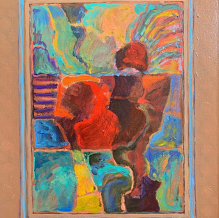
You can check out images of Toni’s artwork below.
Sarra Hochberg, Painter and Graphic Designer
“My three must haves are golden acrylics, aquafine watercolor travel palette,
and a squeegee.”
You can check out Sarra’s artwork below as well as on her website and instagram.
Website: www.smhartwork.com
Instagram: @smhartwork
Renee Leopardi, Pastel Painter
“The 3 must haves for me are:
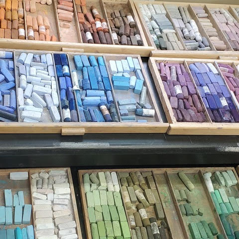
My pastels. I’m not sure if this is ok to count as “one” item because there are so many sticks but without my favorite soft pastels, I would be lost! I’m not a sketchbook person, so my smaller paintings are like studies or quick sketches and I go directly to my pastels for this. My number one brand is Terry Ludwig Soft Pastels so if I had to narrow it down, a small set of Terry Ludwig’s would be perfect.
Sanded Paper. Even though I listed my pastels first, I truly feel you will get much further with the right paper and cheap pastels than you would with expensive pastels and cheap paper. I like to layer my pastels and sanded paper can hold up to 25 layers (hopefully, I don’t need all of those layers!) My preferred brand is Uart.
Music. If I’m painting en plein air, Mother Nature provides all the music I need but when I’m in the studio, music is a must. My IPod Shuffle has everything from Classical, Country, Pop, Classic Rock, Heavy Metal, Soft Rock; basically most anything to go along with whatever I’m painting. For instance, if I’m freely painting a landscape, I can sing along with something fast tempo and upbeat but if I’m painting a portrait, classical works a little better for concentration."
You can check out Renee’s artwork below as well as on her website and instagram.
Website: www.ReneeLeopardi.com
Instragram: @Renee_Leopardi
Annie Portner, Interior Designer
"My favorite tools are a Film Camera (or iPhone camera) because the best photos are usually not planned. A tape measure, because as an interior designer you never know when you’ll have to take a measurement. And colored markers, I color code everything! From floor plans to furniture sketches."
You can check out images of Annie's favorite film photos below.
James Rudman, Video Creator
“My three must-have materials include my camera (Song a6300), my gimbal (Zhiyun Crane Plus), and my editing software (Final Cut Pro X).”
You can check out James’ videography below as well as on his reel on Youtube.
Seeing what other artists use to create helps us to get a new perspective on their creative process and gives us deeper insight into the work they produce. With such great variety in these artists' tool kits, we can see their style manifesting through them. A great artist becomes unstoppable when they have discovered the tools and materials that best support their practice. That is true of this talented group!
I don’t know about you, but I have a whole list of materials, tools, and tips that I need to get in the studio and try out. Thank you to all the artists and designers for your input!
Now, time to create!
What are your must have materials, tools, or digital applications? Have you tried any of these tool kit must haves from these talented artists and designers?































Comments